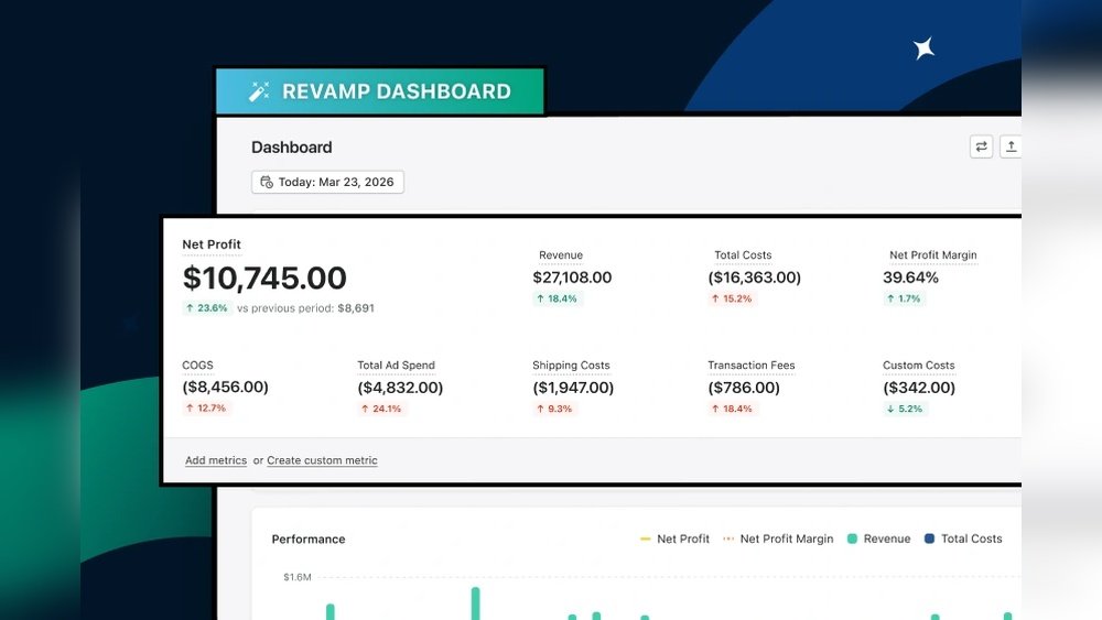
Imagine having a dashboard that shows exactly what you need, without the clutter. Picture your reports flowing smoothly, saving you time and stress.
When your tools work this well, decisions become clearer and work feels easier. You’ll discover how a more focused dashboard and smoother reporting can transform the way you handle data. Keep reading to learn simple changes that can make a big difference for you and your team.
Streamlined Dashboard Design
A streamlined dashboard design helps users focus on the most important data. It makes finding information faster and easier. Clear visuals and simple layouts reduce confusion and improve decision-making.
By organizing content smartly, dashboards become more useful. Users spend less time searching and more time acting on insights. The design supports smooth and efficient reporting.
Key Elements To Include
Start with clear headings for each section. Use charts and graphs that highlight key numbers. Include filters or selectors to customize views quickly. Show real-time data to keep reports up to date. Use consistent colors to group related information. Add tooltips or brief notes to explain complex data. Make sure all elements load fast and work on any device.
Reducing Clutter For Clarity
Remove unnecessary details that distract users. Limit the number of charts on one screen. Use white space to separate different data blocks. Avoid too many colors or fonts that confuse the eye. Focus on essential metrics that drive decisions. Hide advanced options under menus to keep the main view clean. Keep labels short and easy to read.
Customizable Views For Users
Customizable views help users see the data they need fast. They make dashboards clear and easy to use. This feature lets users pick what information shows up. It reduces clutter and boosts productivity. Users get a smoother, more focused reporting experience.
Personalized Data Display
Users can choose which charts and tables appear on their dashboard. They arrange the layout to fit their tasks. This personal touch saves time searching for key details. It helps users track the metrics that matter most. Each dashboard becomes unique to the user’s role and goals.
Role-based Access
Different roles see different data sets on the dashboard. This keeps sensitive information secure and private. Managers get a big-picture view. Team members see only what they need to act on. Role-based access ensures the right data reaches the right people. It supports better decision-making and smooth workflows.
Real-time Data Integration
Real-time data integration lets dashboards show fresh information instantly. It helps teams act fast. Decisions get better and reports stay up-to-date. This keeps everyone on the same page without delay.
Data flows smoothly from different places into one dashboard. This saves time and avoids errors. Users see a clear and focused view of all key data. It makes tracking progress easier and more accurate.
Connecting Multiple Sources
Dashboards collect data from many systems. This includes sales, marketing, and customer service tools. Each source adds a piece to the full picture. Real-time links make sure data updates automatically. No need to check each system separately.
Ensuring Data Accuracy
Accurate data is key for trust and good choices. Integration tools check for errors as data arrives. They fix simple mistakes or warn users about problems. This keeps reports reliable and useful. Clean data means better insights every time.
Automated Reporting Processes
Automated reporting processes make dashboards more focused and reporting smoother. They save time by handling repetitive tasks. Automation helps teams get reports quickly and reliably. This reduces delays and keeps data fresh. Reports are ready when needed without manual work. Automation improves accuracy and consistency in reporting. It frees up time for analysis and decisions. The process is simple but powerful.
Scheduling And Distribution
Automated systems schedule reports at set times. Reports can be sent daily, weekly, or monthly. This ensures everyone gets updates on time. You decide who receives each report. Reports go directly to inboxes or shared folders. No need to remember sending reports manually. Scheduling keeps the team informed without extra effort. Distribution is automatic, reducing missed communications.
Minimizing Manual Errors
Manual report creation often leads to mistakes. Automation removes the risk of human error. Data pulls directly from sources without retyping. Calculations and formatting happen automatically. This keeps reports accurate and consistent. Fewer errors mean better decisions from reliable data. Automated checks catch problems before reports go out. The process builds trust in the numbers shared.
Interactive Visualizations
Interactive visualizations make dashboards clear and easy to use. They help users see data in a simple, visual way. This reduces confusion and speeds up decision-making. Users can explore data by clicking or hovering over charts. This makes reports more lively and useful.
Using Charts And Graphs
Charts and graphs show data in a visual format. They turn numbers into pictures that anyone can understand. Bar charts compare groups side by side. Line graphs track changes over time. Pie charts show parts of a whole. Each type helps highlight important details quickly.
Choosing the right chart depends on the data story. Clear labels and colors improve reading. Simple designs avoid clutter. This keeps the focus on key points. Interactive features let users zoom or filter data. This adds deeper insight without extra pages.
Enhancing User Engagement
Interactive visuals keep users interested in the dashboard. Clicking or hovering reveals extra data or details. Users feel in control of their experience. This leads to better understanding of the report.
Animations and transitions guide the eye smoothly. They help users follow changes step-by-step. Custom filters let users find what matters most. This personalizes the report for each viewer.
Engaged users spend more time exploring data. This results in smarter decisions and clearer insights. Interactive visualizations turn static reports into dynamic tools.
Performance Monitoring And Feedback
Performance monitoring and feedback help improve dashboards and reporting. They provide data on how tools work and guide changes. This process makes dashboards easier to use and reports clearer. Users get better results with less effort.
Tracking Dashboard Usage
Tracking dashboard usage shows which parts users like or avoid. It collects data on clicks, time spent, and feature use. This info reveals which features are helpful or confusing. Teams can remove unused elements and highlight popular ones. Tracking helps focus on areas that need improvement.
Incorporating User Suggestions
User suggestions offer direct ideas to improve dashboards. Listening to users helps find simple fixes and new features. Feedback often points out issues that data alone can’t show. Using these ideas makes tools more user-friendly. It builds trust and encourages more feedback in the future.
Frequently Asked Questions
What Are The Benefits Of A Focused Dashboard?
A focused dashboard highlights key metrics clearly. It helps users track progress efficiently. This improves decision-making and saves time by reducing clutter and distractions.
How Does Smoother Reporting Enhance Business Insights?
Smoother reporting provides faster, error-free data analysis. It enables timely access to accurate information. This helps businesses make informed decisions and respond quickly to market changes.
Can A Focused Dashboard Improve Team Collaboration?
Yes, focused dashboards centralize important data for all team members. This creates transparency and aligns goals. It boosts communication and productivity across departments.
What Features Make Dashboard Reporting Smoother?
Key features include real-time updates, easy customization, and intuitive design. These simplify data interpretation and reduce manual work. Integration with other tools also streamlines workflows.
Conclusion
A focused dashboard helps you find key information fast. Clear reports show data in an easy way. This saves time and lowers stress. Teams can make better choices with quick access. Smooth reporting keeps work running without delays. Small changes lead to big improvements in daily tasks.
Keep your tools simple and organized for success. A clean dashboard and smooth reports support smarter work.

About the Author
Oliver K.G.
Oliver K.G. has 8+ years in pricing strategy and has helped 200+ Amazon FBA sellers, dropshippers, and small business owners optimise their profit margins. He built BizMargin to make gross margin and pricing calculations instant and free. He writes on pricing strategy, gross margin optimisation, and profitability for e-commerce and retail businesses.